Tag Archives: People

Easter Snow: Devant le Deluge

First an earthquake, now a White Easter, if I were superstitious, I should be expecting some further meteoro- geo- or otherological event to be coming up soon.

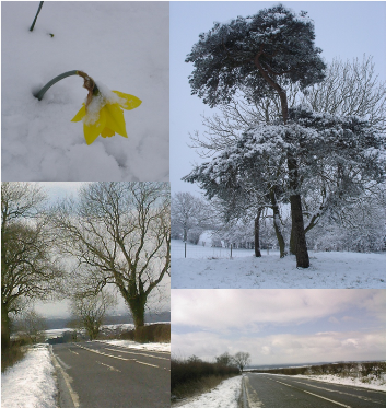
The snowy countryside is certainly pretty…
easter_weather_compressed
..but maybe it could presage the inundation of the low-lying lands by the rising seas.

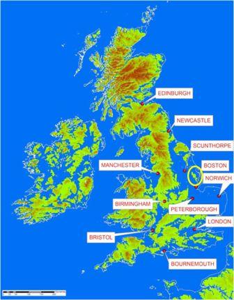
In that event, the Lincolnshire Wolds where I live (ringed in yellow on the map below), would become an island off the east coast of South Yorkshire.

sea_level

Almost serendipitously, I read that the Met Office launched its new “traffic light” severe weather warning system, which was rushed out a day early to announce the snow-storms over the weekend.

I am sure that traffic light afficionados, highways engineers, and railway signalling engineers all over the country will be grinding their teeth because it really is nothing like a proper traffic light at all. It does have the good old red and green, which do not work for the one in 10 red-green colour blind men in the population, but bizarrely, it has both yellow and orange aspects, just to confuse the other 90% of the population. Very democratic, but not very ergnonomic.

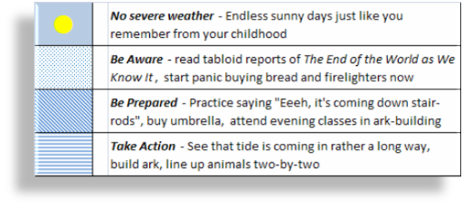
My wife and I have been telling the neighbours for some time that we are going to build a jetty at the end of the lane and park a boat there ready for the floods. So in anticipation of the Deluge, and our future status as island dwellers, it seems an appropriate moment to take a leaf from the Met Office book and create a localised version of the Severe Weather Warning System, below. The legend is helpfully mostly coloured blue…

weather_table

20-20 Hindsight: who needs it?

I have recently been reading “Plundering the Public Sector” by David Craig and Richard Brooks, and now halfway through have been getting more and more irritated with the adversarial tone of the book, and its tendency to shower blame everywhere in unequal amounts.

UK Public Sector projects are usually particularly large (Connecting for Health is quoted as being the largest civilian IT project ever), and inevitably have all the challenges you might expect, and more of them after that.

When discussing the risk profile of projects, I usually use a 2D chart that expresses the two primary dimensions of Work Complexity and Business/Organisational Complexity, a framework drawn from my experience of programme management in large organisations.

The usual chart looks like this:

project_risk_normal

The Work Complexity dimension registers risks like complex technology, logistical scale, dynamic market environment, whereas the Organisation/Business risk dimension registers such factors as poor communication across fragmented, stove-piped structures and populations, divided loyalties, parochial viewpoints and so on, that arise in any large organisation (driven in the main by human nature in all its forms).

However, for monster public sector projects, I would recast it like this:

project_risk_danger

The black area represents the terra incognita where overall risk is extermely high due to the sheer size and people complexity, and other factors which have rarely been experienced before.

Blame-shifting and adversarial attitude are not helpful in the context of programme management, especially when exercised with 20:20 hindsight.

However, agile development methods show the way things can be if they are done right. These methods are rooted in the early insights of people like Barry Boehm, a god of software engineering who brought us this…

boehm_spiral

and this…

boehm_estimating_accuracy

Iterative risk managemnt approach embedded methods can also be applied to business projects as well as pure development.

Maybe the book will get better and more evenly balanced as I read further, and maybe even propose some solutions, but, for now, having incurred my ire, it has been relegated to the bottom of the pile in the throne room where

The Tyranny of the "Customer Journey"

I cover many miles in my working year and am now very familar with the various petrol stations on the routes radiating from Lincolnshire. In my travels, one of the most irritating new inventions of the retail designers is the “Customer Journey”.

The Customer Journey is an useful design concept in the web world to ensure that somebody using an online or multi-channel service gets a joined-up experience, alas more often in the talking than the execution. However, the designers laying out shop formats have now to make this a physical reality, taken to a level of absurdity by the constraints of some service station buildings.

For example, one petrol station I have visited many times used to be like this:

Customer Journey Part 1

Now it looks like this:

Customer Journey Part 2

By the introduction of a silly little metal gate and some plastic signage, they try to make people walk all round the shop so presumably they will suddenly discover they need an electric tyre inflator (only £2.99 with every 20 litres of petrol), or an overwhelming need to stock up on anti-freeze in July.

Maybe the incidence of casual purchases does rise with this type of shop format. However, it does feel much like the customers are treated as dumb cattle being led by the nice man down the corridor to the stunner and the sharp knives.

If other people feel the same way, then I think that the overall effect is probably exactly the reverse of that intended by the designers. Much like that perhaps when Edinburgh drivers rebelled against the disastrous City Centre Traffic Management Scheme which showed that all the modelling in the world is of no use if you do not take account of human quirks and cussedness.

On the first journey when I came across this particular “customer journey”, I clearly had too much time on my hands whilst driving home in the dark hours when I invented a riposte in the form of the Customer Service Self Feedback Form (or the Unhappy Voucher), which I present to you below.

Unhappy Voucher

Click on it, print a copy or two and give some unhappiness to the next person who treats you badly or whose company inflicts some lunacy upon you…

Add to Technorati Favorites

Stupid PIN machine design

According to statistical studies, being taller than average is supposed to bring some advantages in love and money. However, being 6’4″ tall, my experience is certainly different when it comes to being a taller person in an average sized physical world, and I have for many years harboured a paranoid suspicion that there are some chippy design Napoleons out there (you know who you are) deliberately trying to make life miserable for people of greater than average stature.

Air travel is probably the worst: I cannot achieve the “brace” position, instead just bite the seat cushion in front and hope for the best. Also, much touted flat beds are just flying coffins to me, packed like a sardine as I am into a space just wide enough but 4″ too short. Sleep, huh!

Over the last couple of years, various pieces of technology have got closer to the ground to accommodate the needs of wheelchair users and other such. Whilst it would certainly be churlish and ungallant to complain about that in our post-modern world, I will however strongly criticise the engineers who come up with the appalling ergonomics of equipment requiring a CHIP & PIN machine, which they embed three inches into the metalwork at knee level. In the picture shown below, you can see the view I get of a supremely bad example at a local car park…

stupid pin machine

Come on, guys, get a grip and design something that works for everybody!