Tag Archives: humour

The End of Paper as we know it?

Last year I got very excited when I read the news about the launch of the Remarkable Tablet – offering to replace paper in my life – a momentous event, much more impactful than replacing incandescent bulbs with LEDs in the house.  But how and why you may ask?

Early in my work life, I discovered that my short term memory is actually fairly poor short term memory, so I used to keep a little notebook and propelling pencil in my back pocket and scribble aide-memoires whenever.

I learnt this lesson after having meetings with one particular manager who used to say things in his office which all seemed to make sense just then; but once I left the room just made no sense at all.  Big lesson: never leave a room without a) understanding what somebody said, b) writing some notes so that it still made sense later (maybe didn’t because they never made sense in the first place)…

Whilst we are on a brief tangent, apparently the memory thing is supposed to be something to do with the neuro-chemistry of being an introvert – same as the annoying unavailable “tip of the tongue” words, and pithy comments that come to mind 10 minutes after the event…

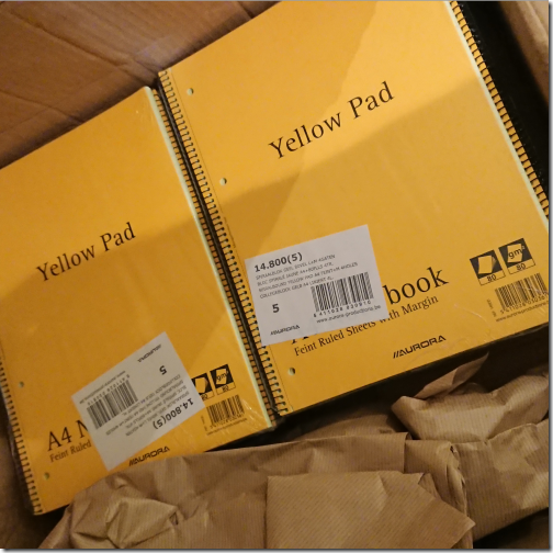
So in my working life, I write a lot of notes in a lot of meetings and get through lots and lots of faithful yellow notebooks (now getting very difficult to source)

Yellow pads

I have been a long time fan of pen-based computing right back to the early 90s and all my laptops since about 2000 have been tablet PCs.  But the experience of writing notes on a PC has never worked for me.  due in part to my appalling handwriting which defies most recognition systems (although Microsoft have produced an outstanding handwriting capability in recent versions of windows, but ultimately, it just doesn’t feel like paper!

I need that slightly resistive feel of the paper – shiny screens with slidey styli just don’t cut it – try a Samsung S-Pen on a Note something.something and no, it just isn’t right (and Android apps are also really not that interested in eInk, either).

So I order my Remarkable Tablet, and waited, and waited, and waited a bit longer, and Hurrah it turned up!

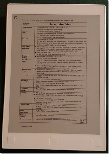
Remarkable Tablet

Then I saw the Sony Digital Paper device, and had to try that too…

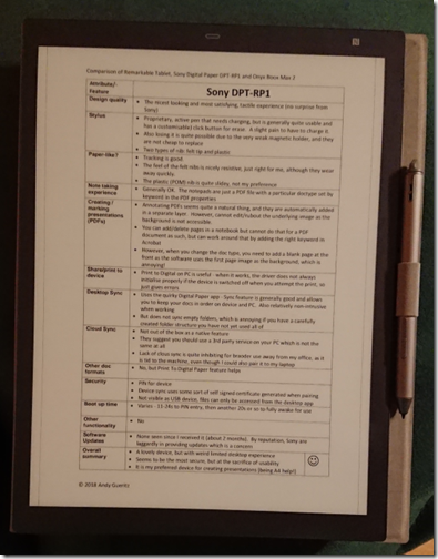
Sony DPT-RP1

…and the Onyx Boox Max 2, and had to try that too…

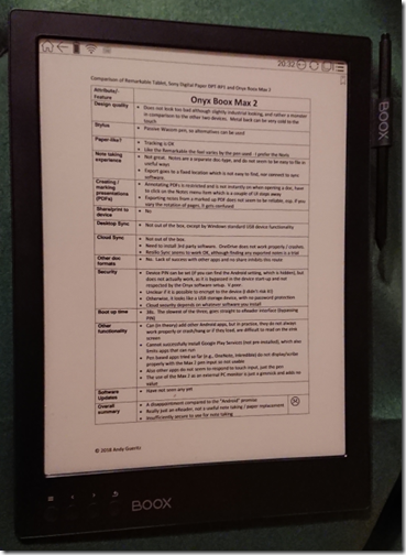
Onyx Boox Max 2

…although I rather wish now I could put that one back in the box and send it back whence it came – sadly a real disappointment.

To satisfy my analytical itch, I worked up an evaluation of all three devices, and you can read the three tables at the tail of this post

Suffice it to say, the roll of honour is like this:

  • the Remarkable Tablet is my choice of companion device to come with me to meetings;
  • the Sony Digital Paper is a lovely device and my favourite for drafting presentations, but tied to my office due to the very limited connectivity;
  • and the Boox Max 2, well, that’s just going to gather dust until the software gets way, way better, or maybe even way, way, way better (and even software may not fix it unless the eInk display and pen can interact with other Android apps)

And to those people who carp about the fact these devices have almost no functionality compared to their AndroiPad, well, so does a piece of paper, and these are way more functional than that!

and as a tailpiece, one of my family said, Tiny Tim style, his little face looking up at me:

Dear Papa, does that mean there will be no more shredding?” – Well, yes, that may just be! 

(And no, the family don’t really talk to me like that)

Evaluation of Remarkable Tablet, Sony DPT-RP1 and Onyx Boox Max 2

Remarkable Tablet

Design quality

Stylus

  • Passive Wacom pen with is OK, however can choose others.
  • The Staedtler Noris is my current favourite
  • Any of them could use a click button to erase.

Paper-like?

  • Great tracking for the ink
  • The feel varies by the pen – the standard pen is a bit slidey for me, I prefer the greater resistance of the Noris stylus, which is as much due to my tendency to scribble unreadable chicken scratch otherwise

Note taking experience

  • Good. Notebooks are easy to create and write in, and can delete pages, but not add them which is a slight annoyance, although not a serious issue, as notes tend to be a stream of words, and pages don’t really matter
  • Some limitations in the current software require a very disciplined work flow to save files to PC (e.g., lack of desktop sync)

Creating / marking presentations (PDFs)

  • Annotating PDF docs is OK, but cannot add or delete pages which is annoying (more of an issue than for notes).
  • Multi-layer capability also means you can edit the original page images, mainly erasing, or just annotate in a separate layer (which you do have to remember to add).
  • There are other various bugs/feature deficiencies in the software at the moment that fixing would improve the usability to another level

Share/print to device

  • Android share to Remarkable is very useful although it does not work for password protected Word document- a Microsoft issue rather than Remarkable

Desktop Sync

  • Indirectly by Cloud service, which then requires manual step to save the PDF to PC file structure
  • Needs automatic sync to desktop folder

Cloud Sync

  • Native support for sync via Wi-Fi to the cloud service is good
  • Will link to my home or phone Wi-Fi hotspot.
  • Have not attempted to link to Wi-Fi that requires login validation via web page

Other doc formats

  • No, but Android app sharing helps with a level of integration

Security

  • PIN for device, one-time code to link device to cloud account.
  • Appears to use SSL protected connections, but otherwise security of cloud service is unknown.
  • SSH access to device allows secure file access
  • The device appears as a CD drive in Windows Explorer, but files are not accessible through that

Boot up time

  • 22s to PIN entry then immediately ready to use
  • OK if just asleep. Otherwise need to plan ahead to make sure it is ready for meetings!

Other functionality

  • No, but sharing on Android does help

Software Updates

  • One so far…hoping for more!

Overall summary

  • This is the best companion device and the one I take to meetings

Sony DPT-RP1

Design quality

  • The nicest looking and most satisfying, tactile experience (no surprise from Sony)

Stylus

  • Proprietary, active pen that needs charging, but is generally quite usable and has a customisable) click button for erase. A slight pain to have to charge it.
  • Also losing it is quite possible due to the very weak magnetic holder, and they are not cheap to replace
  • Two types of nib: felt tip and plastic

Paper-like?

  • Tracking is good.
  • The feel of the felt nibs is nicely resistive, just right for me, although they wear away quickly.
  • The plastic (POM) nib is quite slidey, not my preference

Note taking experience

  • Generally OK. The notepads are just a PDF file with a particular doc-type set by keyword in the PDF properties

Creating / marking presentations (PDFs)

  • Annotating PDFs seems quite a natural thing, and they are automatically added in a separate layer. However, cannot edit/rubout the underlying image as the background is not accessible.
  • You can add/delete pages in a notebook but cannot do that for a PDF document as such, but can work around that by adding the right keyword in Acrobat
  • However, when you change the doc type, you need to add a blank page at the front as the software uses the first page image as the background, which is annoying!

Share/print to device

  • Print to Digital Paper on PC is useful – when it works, the driver does not always initialise properly if the device is switched off when you attempt the print, so just gives errors

Desktop Sync

  • Uses the quirky Digital Paper app – Sync feature is generally good and allows you to keep your docs in order on device and PC. Also relatively non-intrusive when working
  • But does not sync empty folders which is annoying if you have a carefully created folder structure you have not yet used all of

Cloud Sync

  • Not out of the box as a native feature
  • They suggest you should use a 3rd party service on your PC which is not the same at all
  • Lack of cloud sync is quite inhibiting for broader use away from my office, as it is tied to the machine, even though I could also pair it to my laptop

Other doc formats

  • No, but Print To Digital Paper feature helps

Security

  • PIN for device
  • Device sync uses some sort of self signed certificate generated when pairing
  • Not visible as USB device, files can only be accessed from the desktop app

Boot up time

  • Varies – 11-24s to PIN entry, then another 20s or so to fully awake for use

Other functionality

  • No

Software Updates

  • None seen since I received it (about 2 months).
  • By reputation, Sony are laggardly in providing updates which is a concern

Overall summary

  • A lovely device, but with weird limited desktop experience
  • Seems to be the most secure, but at the sacrifice of usability
  • It is my preferred device for creating presentations (being A4 help!)

J

Onyx Boox Max 2

Design quality

  • Does not look too bad although slightly industrial looking, and rather a monster in comparison to the other two devices. Metal back can be very cold to the touch

Stylus

  • Passive Wacom pen, so alternatives can be used

Paper-like?

  • Tracking is OK
  • Like the Remarkable the feel varies by the pen used – I prefer the Noris

Note taking experience

  • Not great. Notes are a separate doc-type, and do not seem to be easy to file in useful ways
  • Export goes to a fixed location which is not easy to find, nor connect to sync software.

Creating / marking presentations (PDFs)

  • Annotating PDFs is restricted and is not instantly on when opening a doc, have to click on the Notes menu item which is a couple of UI steps away
  • Exporting notes from a marked up PDF does not seem to be reliable, esp. if you vary the rotation of pages, it gets confused

Share/print to device

  • No

Desktop Sync

  • Not out of the box, except by Windows standard USB device functionality

Cloud Sync

  • Not out of the box.
  • Need to install 3rd party software. OneDrive does not work properly / crashes.
  • Resilio Sync seems to work OK, although finding any exported notes is a trial

Other doc formats

  • No. Lack of success with other apps and no share inhibits this route

Security

  • Device PIN can be set (if you can find the Android setting, which is hidden), but does not actually work, as it is bypassed in the device start-up and not respected by the Onyx software setup. V.poor.
  • Unclear if it is possible to encrypt to the device (I didn’t risk it!)
  • Otherwise, it looks like a USB storage device, with no password protection
  • Cloud security depends on whatever software you install

Boot up time

  • 38s. The slowest of the three, goes straight to eReader interface (bypassing PIN)

Other functionality

  • Can (in theory) add other Android apps, but in practice, they do not always work properly or crash/hang or if they load, are difficult to read on the eInk screen
  • Cannot successfully install Google Play Services (not pre-installed), which also limits apps that can run
  • Pen based apps tried so far (e.g., OneNote, Inkredible) do not display/scribe properly with the Max 2 pen input so not usable
  • Also other apps do not seem to respond to touch input, just the pen
  • The use of the Max 2 as an external PC monitor is just a gimmick and adds no value

Software Updates

  • Have not seen any yet

Overall summary

  • A disappointment compared to the “Android” promise
  • Really just an eReader, not a useful note taking / paper replacement
  • Insufficiently secure to use for note taking

L

Whither the Customer Journey…

As we have discussed before, the “Customer Journey” is a tool beloved of Marketing people: a near biblical process of revelation delivering an earth-shattering thrill and delight to the lucky consumer – in all, the full showmanship to make buying a salad into a creative “event”.  Indeed, this hell of the “in-shop experience” was visited upon me again in M&S at Paddington Station on Monday evening, my bags hanging off my broad shoulders…

You may ask why I carry my bags when I could have all the convenience of a nice little wheeled travel trolley.  And I answer:

1. I am taller than average (although not in the league of Optimus Prime), and the little trolleys give me backache as the handle is designed only for average height mortals and so I have to bend down to pull, an royal ergonomic PITA (or lower back)

2. Only little old ladies pull trolleys around…to go to the shops

…down this narrow alley of snackery and sugar-filled delights holding my pathetic little pile of greenery, sweeping all behind me off the shelves.  Damn it!!!

And I forgot to pick up a fork in my rush to exit from the tills.  So there’s the bug in the experience, the journey was not “joined up”, it was NOT a good experience for me, I was NOT thrilled, I was NOT delighted.

Thinking back across the years about the perennial search for efficiency in its many forms, you can see an evolution in the focus from Functional (early industrial), through Process Reengineering to Customer Experience (with a brief diversion through Excellence and Chaos, courtesy of Tom Peters).

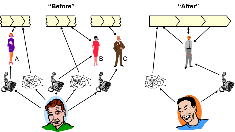
In the 1980s, the essence was this below – joining up the broken bits of process…

Joining up customer experience

…so that a bloke in a blue jersey gets to be deliriously, insanely happy.

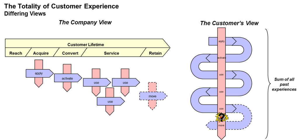
But whilst everybody was futzing with their processes, they were missing the big picture and that in some cases the processes where anyway stupid, idiotic and annoying and the organisation just shambled from one disastrous event to another making the customer really unhappy along the way, like this…

totality of customer experience

…because they needed to think outside-in (like the Customer), not inside-out (like a Company).

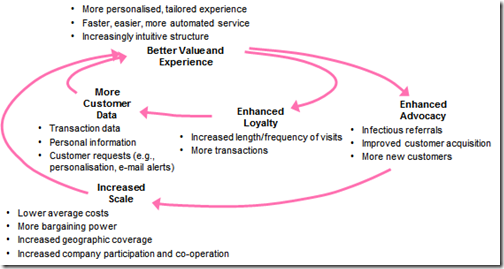
Then somebody had the bright idea to pull into a bit of control theory and cybernetics, and close the loop, so you get concepts like this virtuous cycle of analytical marketing…

analytical marketing

…and get pestered many times a day to complete yet another bl**dy  survey.

M&S did not close the loop with me in my salad-based experience, their grizzly journey designed by trolls, gnomes and cockatrice, staffed by whey-faced minimum wage drudges and drones, toiling in their engine-room of despair.

Cloudy Big Iron and Big Data technologies now allow the feedback loop to be closed faster and in more ways than ever before, such that Amazon can now start shipping stuff before we know we want it…the Pre-Buying version of “Minority Report”’s Pre-Crime?

So where will it all end?

Maybe we can have Pre-Disposal where they ship the Pre-Broken consumer items direct to landfill…

…and “Pre-Paying” where they truncate the whole process and just take money from your bank for the stuff that you would have pre-bought…

…or there will be some sort of “howl round” when the positive feedback gets so intense the whole world just explodes in one enormous debauched orgasm of retail happiness. Wahooey!

Well, time will tell.  Apropos, Salvador Allende was assassinated in Chile as some of his ideas offended some powerful enemies, thus consigning one of the great experiments in cybernetic social feedback systems to history…so there is one lesson to consider.  And the meltdown of algorithmic automated trading systems, the never delivered promise of B2B eCommerce revenue forecasts from 2000, and don’t forget the weather, never forget the weather – a little bit of Chaos can through a massive stick into the bicycle wheel of predictive progress.

So let us continue this “Customer Journey Journey”, “Meta Journey” , or “Journey ^ 2” where it takes us, stepping out hopefully and with gladness and delight in our hearts, and a little small smile on our faces.

Yes, just like that

About Hats…

Whilst recently watching Star Trek Into Darkness, I was somewhat disturbed to see that in this “reimagined” version the familiar old clothing had mutated into something more like Star Wars (or worse still like Starship Troopers).  Indeed, there was Spock in a hat! In a HAT!

This cognitive breakdown is very weird and massively confuses the genres where previously the identification was very simple, thus:

Star Wars

Star Trek

darth vader - iStock_000016847829XSmall (cropped)

⇒    Many hats

⇒     No hats

Easy.

I suppose the issue is that I have a personal “thing” about hats – I just don’t get what they are for, what is their purpose, their raison d’être, their shtick, their meaning and significance

I observed this particular idiosyncrasy really early in life, when I would roll up my school cap and stuff it in my pocket, just couldn’t hack the headwear.

Indeed I can honestly say that I have NEVER put on a hat and said “Mmm, I look good in this”, no, no, no, just never, ever

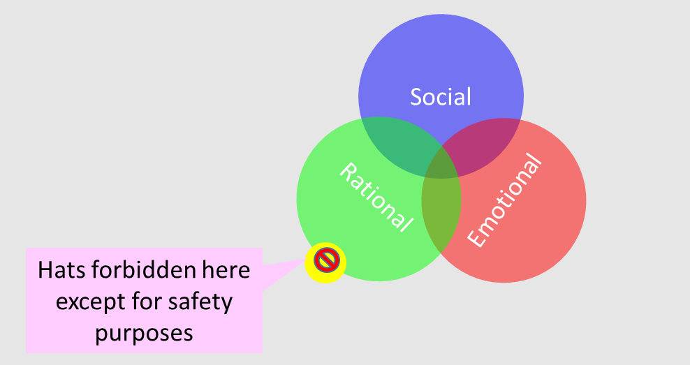
If we were to draw a Venn diagram (based roughly on trusty old Aristotle’s three modes of rhetoric), then my world view is something like this:

Hat Venn

That’s me in the small yellow zone, looking out across from my ivory pillar to the array of vast human variety, like feathered, bicorn hats beloved of plenipotentiaries past and present, and so many more…hats

For the rest of the world, it breaks down roughly like this:

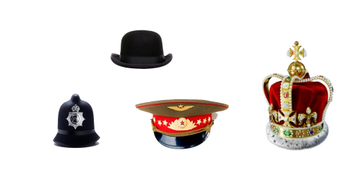
Rational – Practical, functional – protect the precious seat of mind, like this:

Rational Hats

Social – Demonstrate the user’s status and authority, thus:

Social Hats

Emotional – Provocative, decorative, “fun”, scary, viz:

Emotional Hats

For me – No hats, except for safety purposes…occasionally, rarely…

…and probably Spock too, I am sure he would dismiss them as “Illogical, Captain”

Of course there is greater complexity in the love of hats than this rather simplistic analysis (for other people anyway) – it is not black and white, or red-green-blue, or cyan-magenta-yellow or even taupe and teal – and one can draw up some Intersections of the Venn

  • Rational + Social => Hats to recognise advancement (in some rational sphere)?
  • Social + Emotional => Hats to signify membership of particular groups or hats of some spiritual significance?
  • Rational + Emotional => hats that provide some sort of user comfort?
  • Rational + Social + Emotional => often labelled the “sweet spot”, this intersection is likely very small.   Except in Mad Max, the fringed, feathered crash helmets?.

Of these intersections, perhaps one of the most interesting surprising, is the Rational + Emotional as these two domains are often considered to be at different ends of the spectrum, even mutually exclusive.   Although the like of Dan Ariely have shown that this juxtaposition can be very fruitful with his study of behavioural economics.

Maybe “placebo hats” might be a better name for this R+E grouping, since this psychosomatic effect is indeed a big  feature of behavioural economics.

Not just warm woolly head socks, but tinfoil confections and their ilk that give psychological comfort?

The other observation is that the peaked hat is now a conspicuous sign of global millinerial colonisation, as this is one of the most common military and police hats you see in news footage, even from the most exotic, far flung locations!

Projecting this particular observation into the future, with Darwinistic inevitability, everybody in Hatty Town will be wearing peaked hats (By Order, zu befehl), a triumph of militaristic millinery…

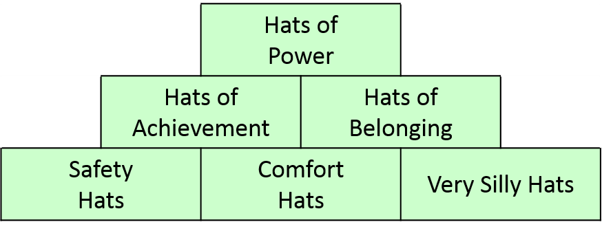
Moving on to apply these thoughts to the more detailed classification, we can derive this convenient framework to classify the universe of hats…

Matrix

If you can explain hats to me, then do drop me a line…and to paraphrase Homer Simpson, I’d love to engage with you in a discourse on the relative merits, but I’m just not interested.

(By the way, if you do succumb to the temptation to look in a mirror wearing your new tapatooey (sic), and think “Mmm, I look really good in this”, then just remember me)

Cool, Not Cool…

This is not a seasonal story about the hot weather, but instead, after a couple of years with my trusty Nokia Lumia 800, I have now upgraded to Windows Phone 8, with a Lumia 925…

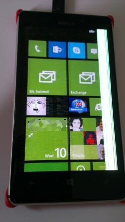
Well, it is actually the second one, first one looked like this after a couple of days.  Nice bright bars down the screen and the rest was fuzzy, so went back for replacement…

Nokia_Lumia_925_with_screen_fault

As I might just have mentioned before, I am quite a fan of Windows Phone, and I was looking back at a random list of Cool & Not Cool things from when I picked up my first WP7 device, an HTC HD7 (having moved then from an HTC HD2), and added a few current observations…

Cool…

Then – WP7 Nov 10 Now – WP8, July 2013
Voice recognition Still quite a cute feature, but rather unreliable if you are out in the sticks with poor 3G connection – the suggested words can be quite hilarious, but often unprintable
Ascetic design, v clean Yup, still nice and clean. Not so sure about the mix of big screens and larger live tiles. I think a one-third size live tile would be good (for three across)
Office integration This just keeps getting better, especially Office 365 integration – but you do need to setup up your account through Office, not the standard account interface, otherwise you can’t add the Office365 location later
Consistent handling of outlook calendar entries e.g. Tentative Yup, took Android a while to catch up with this
Exchange ActiveSync This works nicely, and also connects to legacy Exchange 2003 servers, which Office 2013 will not do
Inbox count new not unread (better than Android) Still a plus point
No Twitter integration Oh dear, this has got worse (yes, Twitter is now integrated).  Twitter is not really my thing, and the integration with the MS account is just a bit too tight. You can tweet stuff you didn’t meant to!
Stuff generally integrated together , e.g., click on senders name in email and go to profile to call This is very neat and intuitive…
Facebook integration and linking different sources into single profile …as is this too
All the stuff that just works,, and makes me go Mmm, and the little surprises that make me go ooh and aaah. Still plenty more Mmm, Oooh and Ahh!

Not Cool…

Then Now
No cut paste and limited multitasking WP7.5 fixed the cut/paste issue, but multi-tasking is still pretty weak. A manifestation is the way Lync wimps out if you don’t use it, and can’t be set to start when the phone powers up so you can miss IM messages
How to easily get a file onto phone without SharePoint? Now that the Office 365 integration works, not really an issue. But the Windows Phone app looks promising too. Being a bit more direct (the Zune connection to my WP7 never seemed to work properly in Win 7 64-bit, so hoping…)
No task synch That was fixed, but, alas, Outlook tasks don’t really cut it for me, anyway.  More anon (below)
Default calendar for meeting invitations Still slightly annoying in that it remembers the last calendar you used (which may not be the one you want).  But actually better than Android, which insists on making Gmail the default calendar…grr
Not always clear which text is active and connects to something else Still true, but I live with it
Proliferation of email tiles – needs universal inbox Fixed in WP7.5, a good feature. Wish I could do it in Outlook!
LinkedIn integration would be good All present and correct since WP7.5
Bluetooth connection to laptop doesn’t seem to work Bluetooth is still pretty naff, no keyboard support etc. And changing the phone name is essential, but you can only do it via the PC app
Bing maps veeerry slow and not obvious you can do anything when it tells you where you almost are (appears to be off by half km or so …) The Nokia stuff is much better
Where is the user manual ? This is still true. Of course, I don’t need the manual to get started with the phone (real men don’t…), but the manual would make an interesting leisure read one evening (a million HTML-borne information fragments don’t do it for me)
Absurdly long SharePoint URLs for Microsoftonline and then it doesn’t work anyway as BPOS SharePoint Online is only 2007, and then phone only works with SharePoint 2010 even though the marketing blurb and help pages tell you how to set it up… WP8 + Office 365 pre-face-lift (i.e., wave 14) both play nicely now. Still waiting for my wave 15 upgrade…
No way to sync call log Damn, this is still true. I really liked the feature of being able to backup my call log, and occasionally look back to who I was talking to when, and how long…
Limited range of settings Well, yes, still.
Outlook (email) white background Definitely fixed now

To-Do, or Not To-Do

The other big change in my electronic life is re-embracing electronic to-do lists.  The otherwise brilliant brain chemistry of the Introvert…

The best bit is that whereas the extrovert brain is only as big as the blob of protoplasm that it is…the Introvert brain is, conceptually at least, bigger inside than out – a veritable cerebral TARDIS of a thing that can hold entire universes!

..means that you are cursed with a relatively poor short term memory.

I can generally remember three things in immediate list memory.  If there are four things to remember, then remembering the fourth item bumps one of the others off the list.  So remembering anything more is quite mentally intensive and may also involve physical props, like knotted handkerchiefs and other aide memoires.  So very early on, I thought “FTFAGOS” and outsourced the mental list to a small leather notebook, with a little gold propelling pencil attached, thrust into the back pocket of my Wranglers (we are talking the 1980s).

There was a long journey after that from pure paper through an electronically assisted paper To-Do list, a sorted list in Excel (printed and inserted in my Filofax), to the miracle of the Psion 3.  I actually rated the 3 higher than the 3a, as the To-Do list had more features but lost the ability to copy and paste the to-do’s into day notes in the calendar, which was a really useful feature to help remember what I did when – still looking to rediscover this long lost feature.  The big point is that some jobs just don’t get finished in one day and will span across multiples, split into bits, “started but not yet finished”.  It probably doesn’t feature in GTD or any other time management scheme, getting some way through a job and saying “I’ve made a start on that, and I’ll finish it tomorrow” is a great motivator.

Lost my memory for about two weeks in about 1990, when I dropped my Psion 3 and the batteries fell out…Psisync kept me safe after that, together with this note

ALWAYS BACKUP YOUR ELECTRONIC BRAIN

scrawled on to the inside of my skull right above my pineal eye…

I abandoned the electronic to-do list when I moved into the consulting world, as the electronics were just not just not up to the frantic, rapid action, agile working, often across multiple projects.

And so to now, In an unscripted moment the other day, one of those procrastinating, displacement activities that was not written on a To-Do list anywhere, I suddenly decided to catch up with the latest and the best in To-Do world.

…in the spirit of discovery and exploration of the world of technology, you understand…

So I have now committed my life to ToodleDo and a carefully selected cross-platform array of mobile clients:

  • Android – ToodleTasks Phone and Tablet editions
  • Windows Phone – Viperal Tasks
  • Windows / Outlookgsyncit (update – 7 Nov 13) Now moved to TaskUnifier Prothe way I would rather use Outlook tasks just does not gel properly with the Toodledo sync’d items, and splurges across my Windows Phone task list too (Update 27 Apr 15) Now that Taskunifier has stopped development, have now moved to TaskAngel Desktop version.
  • Apple iOS – well, you can only have so many fun in your life, and I have no space in mine for an iPhone/iPad…

And I am still seeking the elusive link that allows me capture the electronic audit trail of what I did each day (don’t get me going on electronic timesheets, gah!).

So, with all that electronic support, but for the missing feature, I still have a paper To-Do list for TODAY, and as well as ticking off the jobs I have done today, with a big tick, thus:

Tick

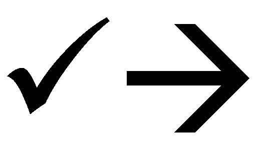
I can TICK OFF THE JOBS THAT I HAVE STARTED AND FEEL GOOD ABOUT THIS EVENING AND KNOW THEY WILL GET FINISHED TOMORROW, (honest), thus:

Partially completed, tick and arrow

Try it for yourself, it will make you feel good, too!

Whither or wither Spreadsheets?

Adding my voice to the many past considering the future direction for spreadsheets…

Why?

Good question! Well it follows from the thoughts in an earlier post about user interfaces, and I am an avid user of spreadsheets and numerical modelling tools

And what does “spreadsheet” mean anyway?  It doesn’t spread anything? Not like a “word processor” processes words

The term is related to an archaic way of keeping your accounts, on a big analysis sheet. I used to get them from Stores when I was a young engineer, and we would use them as desk covers, to scribble random notes, hold our coffee cups, but never added a number up on one (we had already moved from slide rules to calculators with memories, maybe one or two).  You can still buy analysis sheets at Ryman (or maybe you can’t, if you use analysis sheets you might not have a computer…or Interweb)

WHO CARES?

Why are you so angry? Get out of my post!

So what should spreadsheets look like in a touch world with rich mobile clients on tablets?

Aside; I once tried a fully laptop-less day out with just an iPaq, Excel Mobile and virtual laser keyboard.  Suffice it to say what with a bouncy train, small tray table and tiny screen I did no useful work that day! (well it was a corporate karting day so I did some bonding instead…)

Excel and similar don’t really work on a small screen, and even in the touch enabled Office 2013 instantiation the interface is just too clunky, and the analysis pad metaphor becomes less appropriate for useful modelling, when you only have fingers and the on-screen keyboard takes up most of your screen real estate making formula entry a royal pain.

Also spreadsheets do just spread… so you need all the screen you can get.  I have a two screen setup with combined width of nearly a metre.   That’s 350 thousand square millimetres, right there, just for numbers…

Looking at developments you now have hipster ‘sheets like Grid.  So hip, in fact, it does not do any calculations!

Lets just step out of the room for a moment and imagine how that VC pitch went…

  • Pitcher: I’ve got this great idea for a new spreadsheet
  • VC guy: OK.  Tell me something good about it.
  • Pitcher: Well, it’s a grid thing that you can put numbers and text into so that you can organise the page really well…like, in straight lines up and down and across the page…
  • VC Guy: So…it’s a table…
  • Pitcher: (breathlessly, jumping up and down in seat) And what is really exciting is that you can paste pictures of all your friends into it too!
  • VC Guy: So…how do you add up pictures then?  (Said languidly but with a raised eyebrow; you see VC guy does know spreadsheets)
  • Pitcher: Oh, it doesn’t do any calculations, but you can put pictures of your friends it!
  • VC Guy: So…it’s a table…tell me something that is great about it…
  • Pitcher: You can put pictures of your friends in it!
  • VC Guy: So…tell me something else great about it
  • Pitcher: Mrmrmmble…you can put pictures of your friends in it
  • VC Guy: So…WHAT? (stands up, preparing to throw Pitcher into a nearby pit of hungry wolves)
  • Pitcher: Did I say it runs on an iPad?
  • VC Guy: Brilliant!  I’m in, put me down for $25 million! (choir of angels sings, sunshine beams down from the sky)

Well maybe, then maybe not, but we can wonder

On the other end of the spectrum, we have Anago Assemble which has the modelling studio interface down pat (pat-ented, too, according to the website), but it is a previous generation web-only, non-touch system and comes with consulting attached, and no downloadable version.

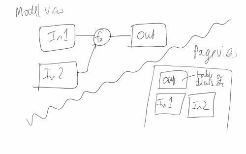
So a touch “spreadsheet” might actually look something like this scribble below…

Touch spreadsheet scribble

…with two views: a model view where you can fondle and dab to make set up the calculations with some nice radial menus, finger friendly szzyzzhing and szzuzzhing of the on-screen objects, carousel effects, and such like, and a page view where you position the output displays (cue more szzyzzhing and szzuzzhing)…but overall it would have to be different, of course, from any patented concepts, which makes it harder…

Not really like the spreadsheets of old, though.  Nuff said.


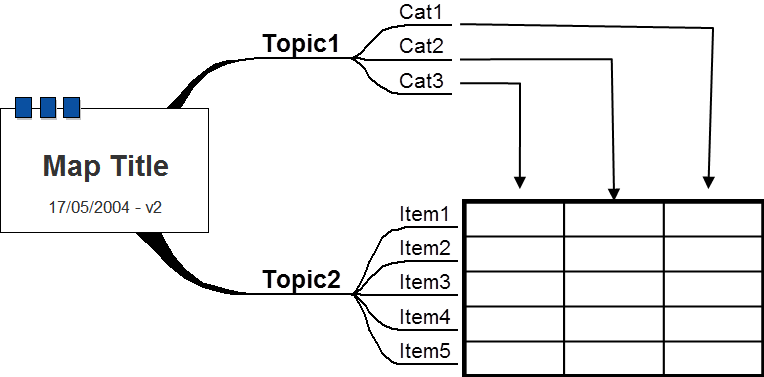
Well not really, one last thing, just down the page here is a whacky idea which is only very peripherally related to the topic of this post and that I once sent to Mindjet in a geeky outburst to help them add a new feature to Mind Manager…a sort of pivot table for Mind Maps.  It would probably have Tony Buzan turning in his grave, but it did get a bee out of my bonnet.  You saw it here first, everybody will want this…

Mind Map Pivot Table concept