I was rather interested to see a post on LinkedIn recently about “The Myth of the Bell Curve” which was saying (relatively) recent research had shown that human performance is more like a Power law distribution, than a Normal distribution.
The consequences of this is that a cherished HR sacred cows needs slaughtering. Anyway you can read the post yourself, however, what tickled my interest is what would the two distributions look like when laid next to each other.
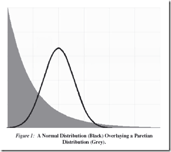
There is an image in the publicity material that attempts to show this…
…but that must be mathematically wrong, surely!
Nurse, bring the oxygen!
Both the Normal Distribution and Power Law are both types of probability density functions. however, as far as I can see from the published links, they have different axes:
- Normal Distribution: X = performance metric, Y = probability of that performance metric
- Power Law : X = some indicator of population; Y = performance metric of some sort
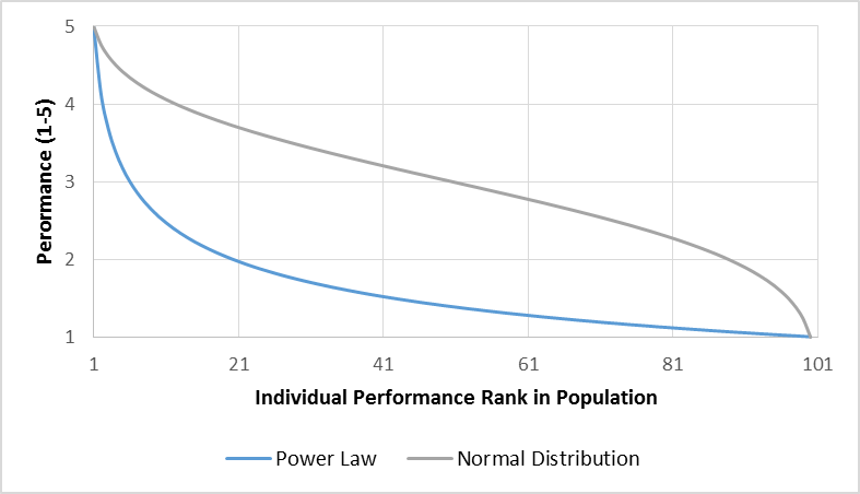
The problem of comparing these two is is that you need to rework the data to get both on the same axes. Making the hypothesis that the x-axis of the Power Law is the performance rank of an individual – like a Zipf curve equivalent.
So X is not the size of the population, ‘cos that is just absurd: the curve would otherwise show that for that any population of 1 is really brilliant, whereas the bigger it gets the more stupid it is…mmmm, weelllll, depends on who is counting themselves as the One, and how many of the rest read the Daily Mail/Mirror/Express/Sun/Star…
So if you work the data on that basis (modelling an arbitrary population size of 100 people) then the curves actually look like this…
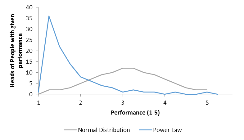
…so they are curves with quite different shapes. And if you re-plot them the other way round, then they look like this…
…which might superficially look like the picture at the top, but is actually showing the population of the long tail as the tall spike, not top performers.
Still a rather scary picture, as it indeed suggests that most of the people in the “team” are rather serious under-performers, hanging on the coat-tails of the many fewer high-flyers!
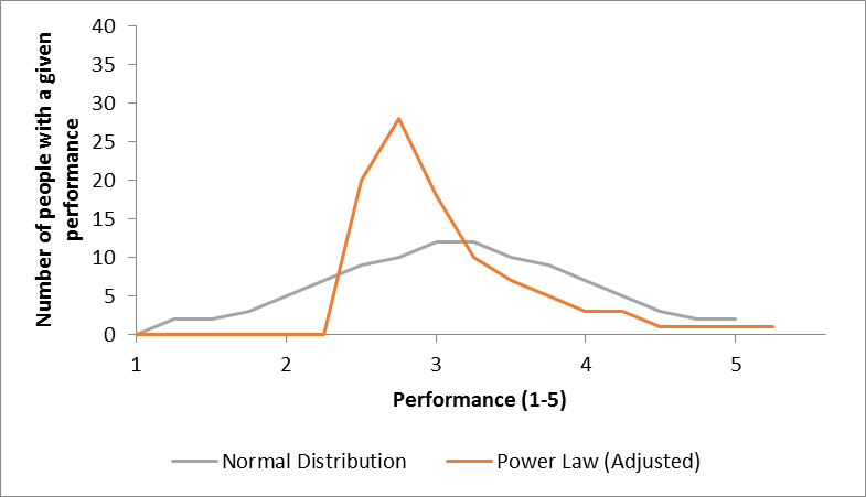
This may be a figment of the example data somewhat, and taking a probably unsubstantiated analytical leap, we can readjust the power law chart to align the median figures of performance and come up with a chart like this…
…which even still suggests that there are a load of sub-middle slackers sitting on their hands, and they should really get moving and DO SOMETHING!
My general theory that if when leaving the house on the way to work in the morning, you harbour the thought that “today, “I will not make a difference”, go back indoors and get back under the duvet.
So I have scratched my itch, not sure it was so much fun for you, so here is another useful framework to help guide thinking and action and considers the destination of projects…
|
Thinking is… |
..rigorous |
A wasted opportunity swirling round the Plug-Hole of Life |
Nirvana |
|
..waffly |
Hell, |
Nuremburg |
|
|
..waffly |
..rigorous |
||
|
Implementation is… |
|||


